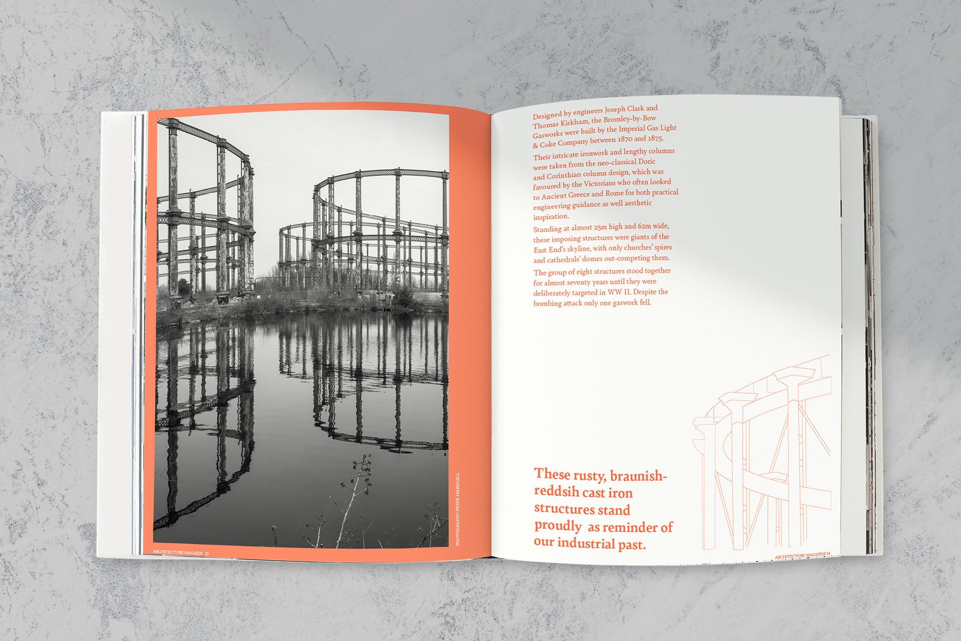
Monthly published print magazine about architecture for design enthusiasts. The design concept behind the article is to connect photography, illustration and typography through contrast, repetition, symmetry and tension in order to emphasize the architectural significance of these magnificent buildings.
The monochromatic orange colour represents the building materials of the structures such as brick and iron as well as their old, rusty nature. The vivid orange tints also provide contrast and freshness to the black and white photography.