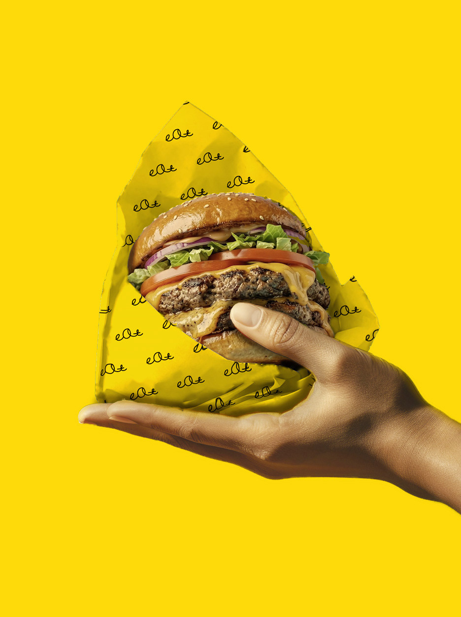
Eat Burger is a delivery-only burger brand based in Nine Elms, London. I was commissioned to create its brand strategy, concept and core identity.
My research found that London's burger brands all compete to sound impressive, with lines like "premier", "best" and "top-rated". Their customers say something different: the food turns up late and cold, and it rarely matches the promise. In a market full of big claims, nobody was offering warmth or honesty. Eat Burger takes that space with the idea "Good is good": no claims, because the facts are enough. Weights, ingredients and prices are stated plainly and written with warmth rather than pride. It's the brand that's glad you ordered.
The identity is simple, honest and well crafted, and it reflects the small family business behind it.
The wordmark takes its shape from a burger bun, with a domed top and a flat base. It's a quiet nod to the product that doesn't need a literal burger icon. The handwritten "eat" is drawn in one continuous line. Its irregular, lowercase letters feel like a real hand made them, a sign that a person is behind the food. It's paired with "BURGER" in a clean sans serif: warm meets straightforward.
The colour palette pairs happy yellow with serious black. The owners are all about positivity, so yellow was important to them, and it stands out in a category where most brands stick to black and white. But burgers are a serious business, so black anchors the palette. Together they say that Eat Burger is a joy to order from and serious about getting it right.